Blurring the lines of print and digital design
Lyttleton design duo wow Ramp audience
For a web-design duo who claimed they had no advice to offer at the end of their Ramp Festival talk, there sure was a lot for students to take away.
Tim Kelleher and Matt Arnold, founders of award-winning studio Sons & Co., emerged from their Lyttleton studio—strategically chosen for its remote location, “colourful” surroundings, and proximity to Tim’s home—to present a talk and workshop on day two of Wintec’s long-running media, art, and design festival.
In a presentation delightfully infused with their own brand of comedy, Tim and Matt shared the philosophies behind their work, and some of the more interesting projects and clients with which they have worked.
Their foray into the world of web-design was born of both a passion for beautiful print media, and disappointment at how carefully laid-out print articles were not given the same treatment in translation to digital format.
“We understood why that was the case, but at the same time, we thought that it didn’t necessarily have to be the case,” said Matt.
The two talked about how they could do things differently, to create websites where the typography and images work together to create the “striking” effects seen in publications such as The New York Times—an effect Tim calls the “printernet.”
A crash course in graphic design
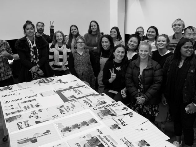
This was brought to life in their afternoon workshop, where computers were turned off in favour of scissors and glue for a session of real-life cut-and-paste.
After a crash course in design history, in which the two self-confessed Modernism nerds posited that reshaping the tittle on Armin Hofman’s 1959 Giselle poster was “the best graphic design move ever made”, participants were given the task to “move things around on a page until they look good”.
Starting with the same grid and basic elements in varying sizes, the results were about 20 vastly different posters, which were then digitally re-created, demonstrating how classic print design principles can be used to create visually striking digital design.
Despite having no website of their own, this approach to web-design has brought Sons & Co. customers from all over the world, many in art and design industries themselves.
One of those clients is Christchurch start-up Neat Places, whose business manager Johnny Gibson also presented at Ramp Festival.
Johnny and co-founder Marcia Butterfield knew of Sons & Co. from having seen their work and working with their other clients, such as Black Estate winery.
“It was actually a goal of hers from as soon as the business started, to have Sons [& Co.] design our website.”
Building trust has been an essential element
Neat Places “trusted their vision on what they could do with the site,” giving over much of the creative control to Sons & Co.
Building trust has been an essential element in Matt and Tim’s success—not only between them and the client, but also trust in their own ideas.
Tim said it is never a case of “how are we going to get this [concept] through?”, but there have been times where they have been surprised that a client has accepted a slightly less conventional idea.
Meanwhile, Matt stressed that over-intellectualising your design can be a trap which costs a project its beauty and human emotion.
“We’re always trying to remind ourselves that what we do is communication: we’re talking to people.”